Case Study
TransferShield
Making digital money transfers safer without making them harder.
A research-informed banking experience that helps customers recognize recipients, understand transaction risks, and confidently decide when to send, verify, or pause.
Making digital money transfers safer without making them harder.
A research-informed banking experience that helps customers recognize recipients, understand transaction risks, and confidently decide when to send, verify, or pause.

Snapshot
Role
Product Designer & UX Researcher
Duration
3 weeks
Type
Independent product concept


The challenge
Sending money has become almost effortless. Knowing whether a payment request is legitimate has not.
Customers are often asked to make financial decisions while navigating unfamiliar recipients, urgent messages, and limited visibility into what happens after a transfer is sent. When security warnings appear too frequently or without context, they become easier to ignore.
The design challenge was to make the right information visible at the right moment without creating unnecessary friction for everyday transactions.
Research from Payments Canada helped establish the problem:
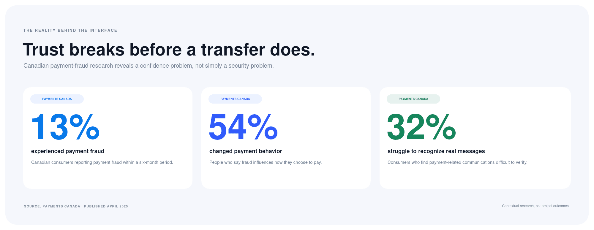
13% of consumers experienced payment fraud within six months.
54% said fraud influences their payment behavior.
32% struggle to recognize legitimate payment-related communications.
These findings suggested that the opportunity was not simply adding more security. It was helping customers make more informed decisions before sending money.
Research approach
I reviewed Canadian payment-fraud research, existing banking experiences, Interac transfer guidance, cybersecurity research, and accessibility standards.
My research focused on four questions:
What information helps customers recognize whether a recipient is legitimate?
Where do existing transfer experiences create uncertainty?
How do urgency and repetitive security prompts influence decision-making?
How can additional verification be introduced without slowing every transaction?

Key Finding
Transfer finality matters. Once an Autodeposit transfer is deposited, it cannot be cancelled. That makes the moments before sending more important than promising an unrealistic way to undo the transaction afterward.
Repetitive warnings lose their effectiveness. Research on security fatigue suggests that constant security demands can influence how people respond. A warning should explain why it appears and reflect the actual situation.
Urgency affects judgment. Fraudulent requests often pressure people to act immediately. Giving customers a clear explanation and a visible way to pause supports more deliberate decision-making.
Existing protections are often disconnected. Banks already provide authentication, alerts, and fraud education. The opportunity is bringing relevant signals together when customers are deciding whether to send money.
Design Direction
The experience follows one core principle:
Security should adapt to the situation without taking control away from the customer.
For familiar payments, the experience remains straightforward. For unfamiliar recipients or unusually large transfers, the interface introduces additional context and verification.
The experience follows one core principle:
Security should adapt to the situation without taking control away from the customer.
For familiar payments, the experience remains straightforward. For unfamiliar recipients or unusually large transfers, the interface introduces additional context and verification.

Familiar transfer: Recognize the recipient, review the details, and send.
Higher-risk transfer: Understand what changed, verify through a trusted method, then continue or pause.
This approach reduces unnecessary friction while introducing stronger protection when the situation warrants it.
Designing for the everyday transfer

The experience moves through four straightforward steps:
Select a recognizable recipient.
Enter the payment amount.
Review the relevant transfer details.
Receive clear confirmation.

Designing for higher-risk moments
When a customer sends an unusually large amount to a new recipient, the interface changes its approach.
Instead of showing a generic fraud alert, it explains the specific signals behind the intervention: an unfamiliar recipient and an amount that differs from the customer’s usual activity.

The higher-risk experience includes:
A plain-language explanation of why the transfer deserves another look.
A reminder that deposited Autodeposit transfers cannot be cancelled.
Verification through a trusted device.
A clear option to pause before any money is sent.
Guidance for contacting the bank through a trusted channel.
The goal is not to frighten customers into stopping. It is to give them enough context to make their own decision.
The higher-risk experience includes:
A plain-language explanation of why the transfer deserves another look.
A reminder that deposited Autodeposit transfers cannot be cancelled.
Verification through a trusted device.
A clear option to pause before any money is sent.
Guidance for contacting the bank through a trusted channel.
The goal is not to frighten customers into stopping. It is to give them enough context to make their own decision.
A consistent experience across devices
The same decision-making principles carry across mobile and desktop.
On desktop, the wider layout presents recipient details, payment information, recognition signals, and transfer finality together. On mobile, the experience prioritizes one decision at a time while keeping essential context visible.

This consistency supports customers who move between devices and helps create a more coherent digital banking experience.
Visual System
The interface uses a restrained visual language designed for clarity, confidence, and accessibility.
Cobalt blue identifies primary actions. Green communicates recognizable or reassuring information. Amber introduces contextual caution without making the experience feel alarming.
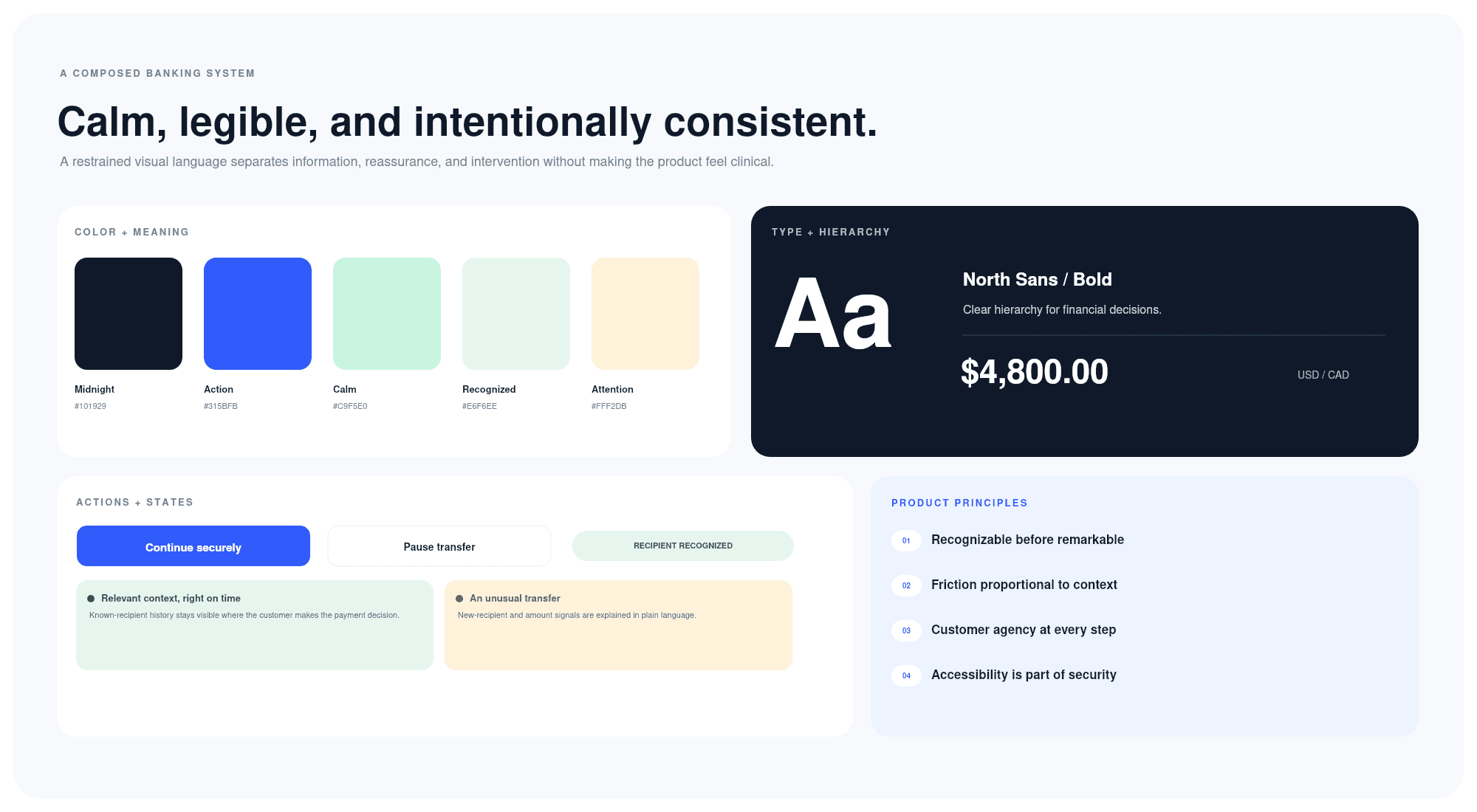
Reusable components include recipient cards, transfer summaries, contextual alerts, verification prompts, primary actions, and secondary options for pausing.
Accessibility and customer agency
Key considerations included:
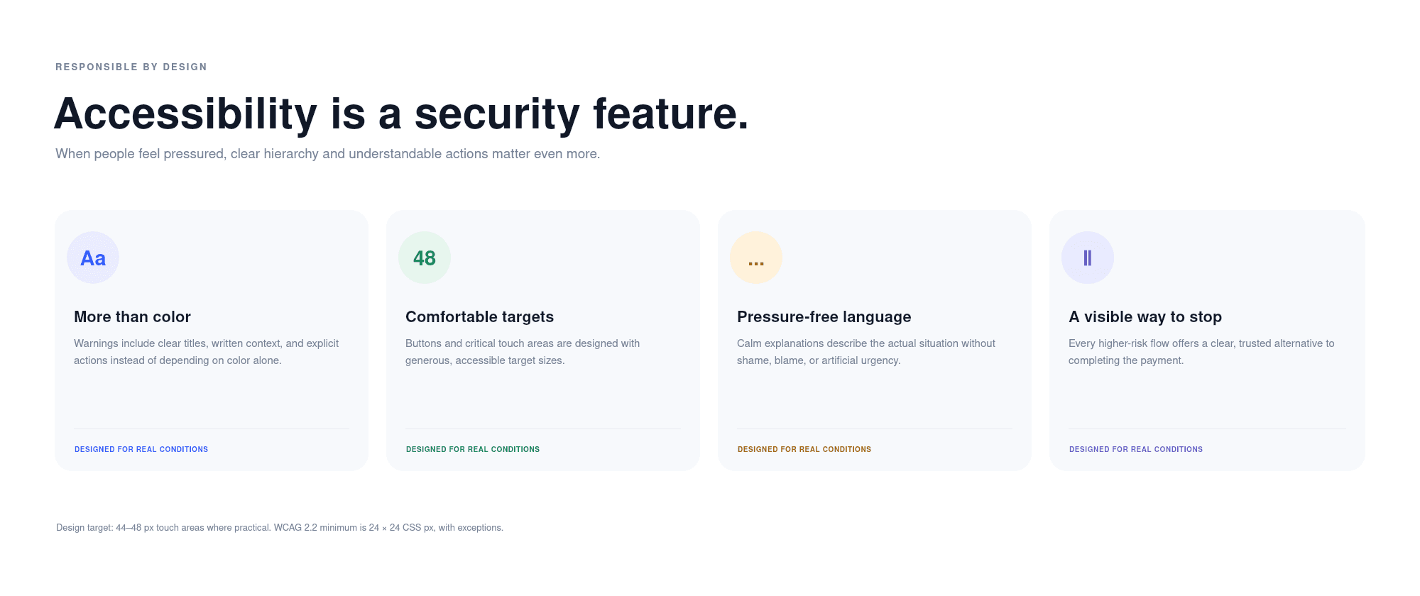
Clear written explanations that do not rely on color alone.
Generous touch targets for important actions.
Consistent visual hierarchy and readable content.
Calm, direct language that avoids blame or artificial urgency.
A visible option to pause or contact the bank securely.
Key considerations included:
Clear written explanations that do not rely on color alone.
Generous touch targets for important actions.
Consistent visual hierarchy and readable content.
Calm, direct language that avoids blame or artificial urgency.
A visible option to pause or contact the bank securely.
Validation and next steps
The next step would be a moderated concept study with approximately 8–12 participants, including frequent transfer users, older customers, and people with varying levels of digital-banking confidence.

The study would evaluate:
Whether customers recognize the intended recipient.
Whether they understand when a transfer becomes irreversible.
Whether they can explain why a security intervention appeared.
Whether familiar transfers remain efficient.
Whether customers can locate a trusted way to pause or contact their bank.
Whether additional verification feels proportionate to the situation.
TransferShield is an independent conceptual project. Research findings informed the design, but no customer interviews, usability results, or product outcomes are presented as completed work.
Case Study
TransferShield
Making digital money transfers safer without making them harder.
A research-informed banking experience that helps customers recognize recipients, understand transaction risks, and confidently decide when to send, verify, or pause.
Making digital money transfers safer without making them harder.
A research-informed banking experience that helps customers recognize recipients, understand transaction risks, and confidently decide when to send, verify, or pause.
Snapshot
Role
Product Designer & UX Researcher
Duration
3 weeks
Type
Independent product concept
The challenge
Sending money has become almost effortless. Knowing whether a payment request is legitimate has not.
Customers are often asked to make financial decisions while navigating unfamiliar recipients, urgent messages, and limited visibility into what happens after a transfer is sent. When security warnings appear too frequently or without context, they become easier to ignore.
The design challenge was to make the right information visible at the right moment without creating unnecessary friction for everyday transactions.
Research from Payments Canada helped establish the problem:
13% of consumers experienced payment fraud within six months.
54% said fraud influences their payment behavior.
32% struggle to recognize legitimate payment-related communications.
These findings suggested that the opportunity was not simply adding more security. It was helping customers make more informed decisions before sending money.
Research approach
I reviewed Canadian payment-fraud research, existing banking experiences, Interac transfer guidance, cybersecurity research, and accessibility standards.
My research focused on four questions:
What information helps customers recognize whether a recipient is legitimate?
Where do existing transfer experiences create uncertainty?
How do urgency and repetitive security prompts influence decision-making?
How can additional verification be introduced without slowing every transaction?
Key Finding
Transfer finality matters. Once an Autodeposit transfer is deposited, it cannot be cancelled. That makes the moments before sending more important than promising an unrealistic way to undo the transaction afterward.
Repetitive warnings lose their effectiveness. Research on security fatigue suggests that constant security demands can influence how people respond. A warning should explain why it appears and reflect the actual situation.
Urgency affects judgment. Fraudulent requests often pressure people to act immediately. Giving customers a clear explanation and a visible way to pause supports more deliberate decision-making.
Existing protections are often disconnected. Banks already provide authentication, alerts, and fraud education. The opportunity is bringing relevant signals together when customers are deciding whether to send money.
Design Direction
The experience follows one core principle:
Security should adapt to the situation without taking control away from the customer.
For familiar payments, the experience remains straightforward. For unfamiliar recipients or unusually large transfers, the interface introduces additional context and verification.
The experience follows one core principle:
Security should adapt to the situation without taking control away from the customer.
For familiar payments, the experience remains straightforward. For unfamiliar recipients or unusually large transfers, the interface introduces additional context and verification.
Familiar transfer: Recognize the recipient, review the details, and send.
Higher-risk transfer: Understand what changed, verify through a trusted method, then continue or pause.
This approach reduces unnecessary friction while introducing stronger protection when the situation warrants it.
Designing for the everyday transfer
The experience moves through four straightforward steps:
Select a recognizable recipient.
Enter the payment amount.
Review the relevant transfer details.
Receive clear confirmation.
Designing for higher-risk moments
When a customer sends an unusually large amount to a new recipient, the interface changes its approach.
Instead of showing a generic fraud alert, it explains the specific signals behind the intervention: an unfamiliar recipient and an amount that differs from the customer’s usual activity.
The higher-risk experience includes:
A plain-language explanation of why the transfer deserves another look.
A reminder that deposited Autodeposit transfers cannot be cancelled.
Verification through a trusted device.
A clear option to pause before any money is sent.
Guidance for contacting the bank through a trusted channel.
The goal is not to frighten customers into stopping. It is to give them enough context to make their own decision.
The higher-risk experience includes:
A plain-language explanation of why the transfer deserves another look.
A reminder that deposited Autodeposit transfers cannot be cancelled.
Verification through a trusted device.
A clear option to pause before any money is sent.
Guidance for contacting the bank through a trusted channel.
The goal is not to frighten customers into stopping. It is to give them enough context to make their own decision.
A consistent experience across devices
The same decision-making principles carry across mobile and desktop.
On desktop, the wider layout presents recipient details, payment information, recognition signals, and transfer finality together. On mobile, the experience prioritizes one decision at a time while keeping essential context visible.
This consistency supports customers who move between devices and helps create a more coherent digital banking experience.
Visual System
The interface uses a restrained visual language designed for clarity, confidence, and accessibility.
Cobalt blue identifies primary actions. Green communicates recognizable or reassuring information. Amber introduces contextual caution without making the experience feel alarming.
Reusable components include recipient cards, transfer summaries, contextual alerts, verification prompts, primary actions, and secondary options for pausing.
Accessibility and customer agency
Key considerations included:
Clear written explanations that do not rely on color alone.
Generous touch targets for important actions.
Consistent visual hierarchy and readable content.
Calm, direct language that avoids blame or artificial urgency.
A visible option to pause or contact the bank securely.
Key considerations included:
Clear written explanations that do not rely on color alone.
Generous touch targets for important actions.
Consistent visual hierarchy and readable content.
Calm, direct language that avoids blame or artificial urgency.
A visible option to pause or contact the bank securely.
Validation and next steps
The next step would be a moderated concept study with approximately 8–12 participants, including frequent transfer users, older customers, and people with varying levels of digital-banking confidence.
The study would evaluate:
Whether customers recognize the intended recipient.
Whether they understand when a transfer becomes irreversible.
Whether they can explain why a security intervention appeared.
Whether familiar transfers remain efficient.
Whether customers can locate a trusted way to pause or contact their bank.
Whether additional verification feels proportionate to the situation.
TransferShield is an independent conceptual project. Research findings informed the design, but no customer interviews, usability results, or product outcomes are presented as completed work.
Case Study
TransferShield
Making digital money transfers safer without making them harder.
A research-informed banking experience that helps customers recognize recipients, understand transaction risks, and confidently decide when to send, verify, or pause.
Making digital money transfers safer without making them harder.
A research-informed banking experience that helps customers recognize recipients, understand transaction risks, and confidently decide when to send, verify, or pause.
Snapshot
Role
Product Designer & UX Researcher
Duration
3 weeks
Type
Independent product concept
The challenge
Sending money has become almost effortless. Knowing whether a payment request is legitimate has not.
Customers are often asked to make financial decisions while navigating unfamiliar recipients, urgent messages, and limited visibility into what happens after a transfer is sent. When security warnings appear too frequently or without context, they become easier to ignore.
The design challenge was to make the right information visible at the right moment without creating unnecessary friction for everyday transactions.
Research from Payments Canada helped establish the problem:
13% of consumers experienced payment fraud within six months.
54% said fraud influences their payment behavior.
32% struggle to recognize legitimate payment-related communications.
These findings suggested that the opportunity was not simply adding more security. It was helping customers make more informed decisions before sending money.
Research approach
I reviewed Canadian payment-fraud research, existing banking experiences, Interac transfer guidance, cybersecurity research, and accessibility standards.
My research focused on four questions:
What information helps customers recognize whether a recipient is legitimate?
Where do existing transfer experiences create uncertainty?
How do urgency and repetitive security prompts influence decision-making?
How can additional verification be introduced without slowing every transaction?
Key Finding
Transfer finality matters. Once an Autodeposit transfer is deposited, it cannot be cancelled. That makes the moments before sending more important than promising an unrealistic way to undo the transaction afterward.
Repetitive warnings lose their effectiveness. Research on security fatigue suggests that constant security demands can influence how people respond. A warning should explain why it appears and reflect the actual situation.
Urgency affects judgment. Fraudulent requests often pressure people to act immediately. Giving customers a clear explanation and a visible way to pause supports more deliberate decision-making.
Existing protections are often disconnected. Banks already provide authentication, alerts, and fraud education. The opportunity is bringing relevant signals together when customers are deciding whether to send money.
Design Direction
The experience follows one core principle:
Security should adapt to the situation without taking control away from the customer.
For familiar payments, the experience remains straightforward. For unfamiliar recipients or unusually large transfers, the interface introduces additional context and verification.
The experience follows one core principle:
Security should adapt to the situation without taking control away from the customer.
For familiar payments, the experience remains straightforward. For unfamiliar recipients or unusually large transfers, the interface introduces additional context and verification.
Familiar transfer: Recognize the recipient, review the details, and send.
Higher-risk transfer: Understand what changed, verify through a trusted method, then continue or pause.
This approach reduces unnecessary friction while introducing stronger protection when the situation warrants it.
Designing for the everyday transfer
The experience moves through four straightforward steps:
Select a recognizable recipient.
Enter the payment amount.
Review the relevant transfer details.
Receive clear confirmation.
Designing for higher-risk moments
When a customer sends an unusually large amount to a new recipient, the interface changes its approach.
Instead of showing a generic fraud alert, it explains the specific signals behind the intervention: an unfamiliar recipient and an amount that differs from the customer’s usual activity.
The higher-risk experience includes:
A plain-language explanation of why the transfer deserves another look.
A reminder that deposited Autodeposit transfers cannot be cancelled.
Verification through a trusted device.
A clear option to pause before any money is sent.
Guidance for contacting the bank through a trusted channel.
The goal is not to frighten customers into stopping. It is to give them enough context to make their own decision.
The higher-risk experience includes:
A plain-language explanation of why the transfer deserves another look.
A reminder that deposited Autodeposit transfers cannot be cancelled.
Verification through a trusted device.
A clear option to pause before any money is sent.
Guidance for contacting the bank through a trusted channel.
The goal is not to frighten customers into stopping. It is to give them enough context to make their own decision.
A consistent experience across devices
The same decision-making principles carry across mobile and desktop.
On desktop, the wider layout presents recipient details, payment information, recognition signals, and transfer finality together. On mobile, the experience prioritizes one decision at a time while keeping essential context visible.
This consistency supports customers who move between devices and helps create a more coherent digital banking experience.
Visual System
The interface uses a restrained visual language designed for clarity, confidence, and accessibility.
Cobalt blue identifies primary actions. Green communicates recognizable or reassuring information. Amber introduces contextual caution without making the experience feel alarming.
Reusable components include recipient cards, transfer summaries, contextual alerts, verification prompts, primary actions, and secondary options for pausing.
Accessibility and customer agency
Key considerations included:
Clear written explanations that do not rely on color alone.
Generous touch targets for important actions.
Consistent visual hierarchy and readable content.
Calm, direct language that avoids blame or artificial urgency.
A visible option to pause or contact the bank securely.
Key considerations included:
Clear written explanations that do not rely on color alone.
Generous touch targets for important actions.
Consistent visual hierarchy and readable content.
Calm, direct language that avoids blame or artificial urgency.
A visible option to pause or contact the bank securely.
Validation and next steps
The next step would be a moderated concept study with approximately 8–12 participants, including frequent transfer users, older customers, and people with varying levels of digital-banking confidence.
The study would evaluate:
Whether customers recognize the intended recipient.
Whether they understand when a transfer becomes irreversible.
Whether they can explain why a security intervention appeared.
Whether familiar transfers remain efficient.
Whether customers can locate a trusted way to pause or contact their bank.
Whether additional verification feels proportionate to the situation.
TransferShield is an independent conceptual project. Research findings informed the design, but no customer interviews, usability results, or product outcomes are presented as completed work.