Case Study # 1
Healix - Healthcare Companion
Healix is a healthcare app concept inspired by my experience designing patient-facing and practitioner-facing digital tools in regulated healthcare environments. Due to NDA restrictions, the screens, brand, and flows have been recreated as an independent concept while preserving the type of design challenges I worked through: accessibility, trust, routine-building, and simplifying complex health information.
(Backed by my 8 months of dedicated AI Conversational UI design at HCLTech)

Snapshot
Role
UX/UI Designer, Researcher
Duration
4 weeks
Type
Concept based on project at HCLTech


Overview
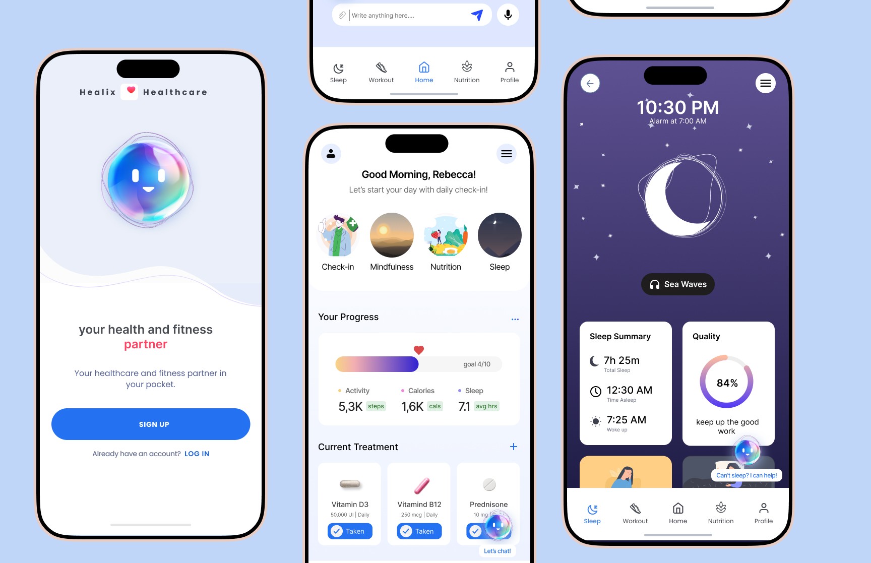
Healix is a mobile health companion designed to help people manage long-term health routines with less friction. The app brings medication reminders, habit tracking, accessibility preferences, and conversational guidance into one calm, easy-to-use experience.
The goal was not to create another data-heavy health dashboard. It was to design a supportive tool that helps users understand what to do next, stay consistent with care routines, and feel more in control of their day-to-day health.

Problem
People managing chronic or long-term conditions often rely on multiple tools to track medication, appointments, symptoms, diet, sleep, and exercise. This creates a scattered experience where important health actions can easily be missed or forgotten.
For users with accessibility needs, anxiety, ADHD, or low digital confidence, traditional health apps can feel overwhelming. The core challenge was to simplify health management without removing the depth users need to make informed decisions.

Design Challenge
How might we design a healthcare companion that supports daily health routines, keeps information easy to understand, and gives users more control without adding more cognitive load?


My Role
I led the UX and UI direction for this concept, including research synthesis, user flows, wireframes, visual design, accessibility considerations, prototyping, and usability testing.
My focus was on translating complex healthcare needs into a product experience that felt approachable, trustworthy, and easy to use across different levels of digital comfort.

Solution
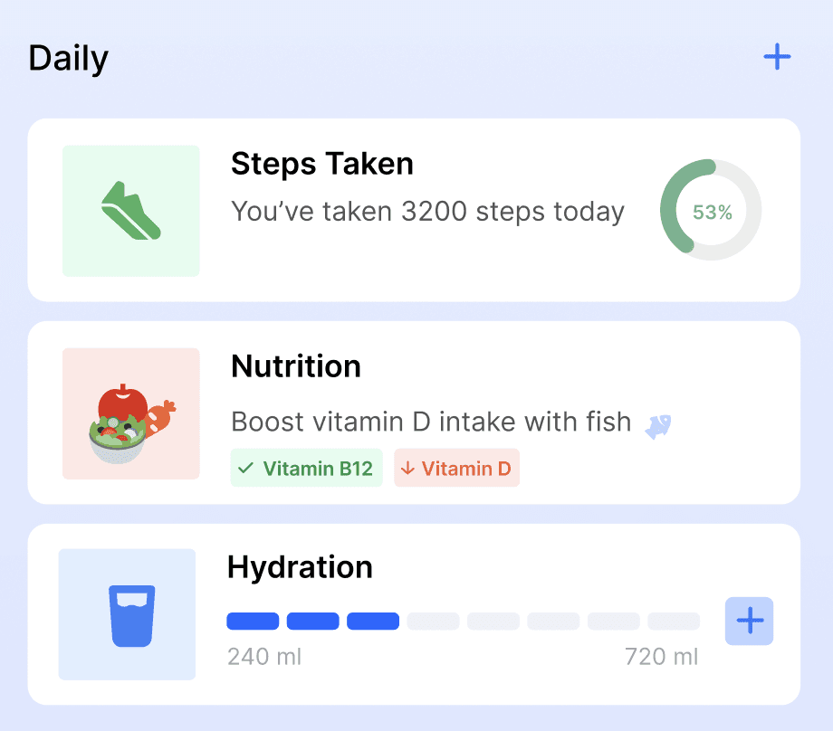
I designed Healix as a personalized health companion with a calm interface, clear routine structure, and accessibility-first interaction patterns. The experience focuses on helping users complete key actions quickly, such as logging medication, reviewing progress, adjusting accessibility settings, and receiving simple guidance through a chatbot-style assistant.
Instead of overwhelming users with dense medical data, Healix prioritizes clarity, reassurance, and action-based design.

Goals & Success Metrics
Improve adherence to daily health tasks (meds, sleep, activity)
Reduce cognitive load and interface friction
Foster user trust and emotional ease
Ensure accessibility and inclusivity for all users

Design Decisions
1. Calm onboarding instead of a long medical form
I kept onboarding short and progressive so users could set up their profile without feeling overwhelmed. Health goals, accessibility needs, and reminder preferences were introduced step by step.
2. Action-first dashboard
The dashboard was designed around the user’s next most important actions, such as medication, symptoms, sleep, and routine progress, instead of showing every data point at once.
3. Accessible controls within reach
Text size, contrast, and reminder preferences were made visible early in the experience so users could adjust the app before completing key tasks.
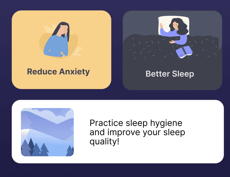
4. Chatbot as guidance, not diagnosis
The assistant was designed to help users navigate routines, understand general wellness patterns, and find next steps. It avoids replacing medical advice and keeps the user in control.

Research
To better understand user needs, I conducted interviews with people managing chronic health routines and caregivers who support them. I also reviewed existing health and wellness apps to identify common gaps in accessibility, onboarding, tracking, and user trust.
The research showed that users were not only looking for reminders. They wanted a system that could reduce mental effort, explain information clearly, and help them feel less alone while managing their health.
Summary:
Interviewed 6 chronic illness patients and 2 caregivers to understand daily health struggles
Conducted competitor audit (e.g., MyChart, Ada, Samsung Health)
Noted gaps in emotional support, data clarity, and accessibility compliance
Accessibility heuristics used to assess gaps in current mobile tools

Personas
Primary Persona: Ayesha
Age
47
Condition
Type 2 Diabetes, early-stage glaucoma
Goals
Stay consistent with medication, monitor glucose levels, and maintain a healthy routine without feeling overwhelmed.
Pain Points
Struggles with reading small text on apps, forgets to take meds on time, and often finds existing tools too complicated or cluttered.
Tech Use
Comfortable with messaging apps, prefers visual aids and reminders.
Secondary Persona: Rafael
Age
31
Condition
ADHD, mild anxiety
Goals
Stick to a regular diet and sleep cycle, reduce distractions, and build healthy habits.
Pain Points
Gets easily distracted, needs structured reminders and visual feedback, feels anxious using rigid or clinical-feeling apps.
Tech Use
Highly familiar with mobile apps, prefers casual tones and gamified feedback.


Wireframe and Prototypes
I started with low-fidelity wireframes to map the core experience: onboarding, dashboard, medication tracking, progress review, chatbot support, and accessibility settings.
The early wireframes helped test the hierarchy of information before refining the visual design. I focused on reducing unnecessary steps, keeping primary actions visible, and making each screen feel calm enough for users who may already be stressed or fatigued.


Usability Testing
I tested the prototype with users to understand whether the main flows were clear, accessible, and easy to complete. Participants were asked to complete common tasks such as setting a medication reminder, adjusting accessibility preferences, reviewing progress, and using the assistant for guidance.
The testing helped reveal where users hesitated, which labels needed to be clearer, and which actions needed stronger visual priority.
Iterations Made
Moved accessibility settings earlier in the flow
Users expected text size and contrast controls to be available before using the app deeply, so I made these preferences easier to access during onboarding and from the main dashboard.
Simplified the dashboard hierarchy
The first version showed too many health categories at once. I refined the dashboard to focus on the most urgent daily actions first, then moved secondary information lower on the screen.
Clarified chatbot boundaries
I adjusted the chatbot language to feel supportive while making it clear that the assistant provides guidance, not medical diagnosis.

Key Insights
Users needed clarity, not more data.
Many health apps show progress through charts and dense dashboards, but users wanted simpler summaries that helped them understand what action to take next.
Accessibility needed to be available early.
Users with vision, attention, or cognitive challenges benefited from larger text, high contrast, and simple navigation. These settings needed to be easy to find, not hidden deep inside profile settings.
Trust depended on tone and control.
Because health data is personal, users needed clear consent, privacy cues, and an assistant that felt supportive without pretending to replace professional medical care.
Summary:
Users loved the gentle, affirming language and daily structure.
Most found the chatbot easy to use but preferred shorter response options.
Accessibility toggles (text size, dark mode) were hard to find initially.
Image-based meal logging and voice input reduced interaction friction.

Outcomes & Impact
The final prototype improved the clarity of key health-management flows and reduced friction across medication logging, progress review, and chatbot navigation.
In usability testing, users were able to complete core tasks more quickly after the interface was simplified. Three out of four participants said they would consider using the app daily, especially because of its calm visual design, routine-based structure, and accessible controls.
Accessibility improvements included larger tap targets, clearer contrast, adjustable text preferences, simplified navigation, and consent-first onboarding for sensitive health information.

Reflection
This project strengthened my approach to designing for healthcare environments where clarity, trust, and accessibility are essential. I learned that a successful health product does not need to show users everything at once. It needs to help them understand what matters now, what action they can take next, and how to stay consistent without feeling overwhelmed.
The biggest design lesson was that accessibility is not a final polish step. It needs to shape the structure, language, and interaction model from the beginning.
Case Study # 1
Healix - Healthcare Companion
Healix is a healthcare app concept inspired by my experience designing patient-facing and practitioner-facing digital tools in regulated healthcare environments. Due to NDA restrictions, the screens, brand, and flows have been recreated as an independent concept while preserving the type of design challenges I worked through: accessibility, trust, routine-building, and simplifying complex health information.
(Backed by my 8 months of dedicated AI Conversational UI design at HCLTech)
Snapshot
Role
UX/UI Designer, Researcher
Duration
4 weeks
Type
Concept based on project at HCLTech
Overview
Healix is a mobile health companion designed to help people manage long-term health routines with less friction. The app brings medication reminders, habit tracking, accessibility preferences, and conversational guidance into one calm, easy-to-use experience.
The goal was not to create another data-heavy health dashboard. It was to design a supportive tool that helps users understand what to do next, stay consistent with care routines, and feel more in control of their day-to-day health.
Problem
People managing chronic or long-term conditions often rely on multiple tools to track medication, appointments, symptoms, diet, sleep, and exercise. This creates a scattered experience where important health actions can easily be missed or forgotten.
For users with accessibility needs, anxiety, ADHD, or low digital confidence, traditional health apps can feel overwhelming. The core challenge was to simplify health management without removing the depth users need to make informed decisions.
Design Challenge
How might we design a healthcare companion that supports daily health routines, keeps information easy to understand, and gives users more control without adding more cognitive load?
My Role
I led the UX and UI direction for this concept, including research synthesis, user flows, wireframes, visual design, accessibility considerations, prototyping, and usability testing.
My focus was on translating complex healthcare needs into a product experience that felt approachable, trustworthy, and easy to use across different levels of digital comfort.
Solution
I designed Healix as a personalized health companion with a calm interface, clear routine structure, and accessibility-first interaction patterns. The experience focuses on helping users complete key actions quickly, such as logging medication, reviewing progress, adjusting accessibility settings, and receiving simple guidance through a chatbot-style assistant.
Instead of overwhelming users with dense medical data, Healix prioritizes clarity, reassurance, and action-based design.
Goals & Success Metrics
Improve adherence to daily health tasks (meds, sleep, activity)
Reduce cognitive load and interface friction
Foster user trust and emotional ease
Ensure accessibility and inclusivity for all users
Design Decisions
1. Calm onboarding instead of a long medical form
I kept onboarding short and progressive so users could set up their profile without feeling overwhelmed. Health goals, accessibility needs, and reminder preferences were introduced step by step.
2. Action-first dashboard
The dashboard was designed around the user’s next most important actions, such as medication, symptoms, sleep, and routine progress, instead of showing every data point at once.
3. Accessible controls within reach
Text size, contrast, and reminder preferences were made visible early in the experience so users could adjust the app before completing key tasks.
4. Chatbot as guidance, not diagnosis
The assistant was designed to help users navigate routines, understand general wellness patterns, and find next steps. It avoids replacing medical advice and keeps the user in control.
Research
To better understand user needs, I conducted interviews with people managing chronic health routines and caregivers who support them. I also reviewed existing health and wellness apps to identify common gaps in accessibility, onboarding, tracking, and user trust.
The research showed that users were not only looking for reminders. They wanted a system that could reduce mental effort, explain information clearly, and help them feel less alone while managing their health.
Summary:
Interviewed 6 chronic illness patients and 2 caregivers to understand daily health struggles
Conducted competitor audit (e.g., MyChart, Ada, Samsung Health)
Noted gaps in emotional support, data clarity, and accessibility compliance
Accessibility heuristics used to assess gaps in current mobile tools
Personas
Primary Persona: Ayesha
Age
47
Condition
Type 2 Diabetes, early-stage glaucoma
Goals
Stay consistent with medication, monitor glucose levels, and maintain a healthy routine without feeling overwhelmed.
Pain Points
Struggles with reading small text on apps, forgets to take meds on time, and often finds existing tools too complicated or cluttered.
Tech Use
Comfortable with messaging apps, prefers visual aids and reminders.
Secondary Persona: Rafael
Age
31
Condition
ADHD, mild anxiety
Goals
Stick to a regular diet and sleep cycle, reduce distractions, and build healthy habits.
Pain Points
Gets easily distracted, needs structured reminders and visual feedback, feels anxious using rigid or clinical-feeling apps.
Tech Use
Highly familiar with mobile apps, prefers casual tones and gamified feedback.
Wireframe and Prototypes
I started with low-fidelity wireframes to map the core experience: onboarding, dashboard, medication tracking, progress review, chatbot support, and accessibility settings.
The early wireframes helped test the hierarchy of information before refining the visual design. I focused on reducing unnecessary steps, keeping primary actions visible, and making each screen feel calm enough for users who may already be stressed or fatigued.
Usability Testing
I tested the prototype with users to understand whether the main flows were clear, accessible, and easy to complete. Participants were asked to complete common tasks such as setting a medication reminder, adjusting accessibility preferences, reviewing progress, and using the assistant for guidance.
The testing helped reveal where users hesitated, which labels needed to be clearer, and which actions needed stronger visual priority.
Iterations Made
Moved accessibility settings earlier in the flow
Users expected text size and contrast controls to be available before using the app deeply, so I made these preferences easier to access during onboarding and from the main dashboard.
Simplified the dashboard hierarchy
The first version showed too many health categories at once. I refined the dashboard to focus on the most urgent daily actions first, then moved secondary information lower on the screen.
Clarified chatbot boundaries
I adjusted the chatbot language to feel supportive while making it clear that the assistant provides guidance, not medical diagnosis.
Key Insights
Users needed clarity, not more data.
Many health apps show progress through charts and dense dashboards, but users wanted simpler summaries that helped them understand what action to take next.
Accessibility needed to be available early.
Users with vision, attention, or cognitive challenges benefited from larger text, high contrast, and simple navigation. These settings needed to be easy to find, not hidden deep inside profile settings.
Trust depended on tone and control.
Because health data is personal, users needed clear consent, privacy cues, and an assistant that felt supportive without pretending to replace professional medical care.
Summary:
Users loved the gentle, affirming language and daily structure.
Most found the chatbot easy to use but preferred shorter response options.
Accessibility toggles (text size, dark mode) were hard to find initially.
Image-based meal logging and voice input reduced interaction friction.
Outcomes & Impact
The final prototype improved the clarity of key health-management flows and reduced friction across medication logging, progress review, and chatbot navigation.
In usability testing, users were able to complete core tasks more quickly after the interface was simplified. Three out of four participants said they would consider using the app daily, especially because of its calm visual design, routine-based structure, and accessible controls.
Accessibility improvements included larger tap targets, clearer contrast, adjustable text preferences, simplified navigation, and consent-first onboarding for sensitive health information.
Reflection
This project strengthened my approach to designing for healthcare environments where clarity, trust, and accessibility are essential. I learned that a successful health product does not need to show users everything at once. It needs to help them understand what matters now, what action they can take next, and how to stay consistent without feeling overwhelmed.
The biggest design lesson was that accessibility is not a final polish step. It needs to shape the structure, language, and interaction model from the beginning.