Case Study
AERIS
Every gate. Every connection. A little less chaos.
A research-informed airline experience that helps passengers navigate unfamiliar airports, understand their connections, respond to gate changes, and travel with greater confidence.
Every gate. Every connection. A little less chaos.
A research-informed airline experience that helps passengers navigate unfamiliar airports, understand their connections, respond to gate changes, and travel with greater confidence.

Snapshot
Role
Product designer and UX researcher
Duration
3 weeks
Type
Independent conceptual case study
Focus
Airport navigation, connecting flights, accessibility, and disruption management

The challenge
Booking a flight is rarely the most stressful part of traveling. The uncertainty begins when passengers arrive at the airport and need to find their gate, understand a connection, manage their luggage, or react to sudden changes.
Existing tools can help, but relevant information is often scattered across airline apps, airport websites, boarding passes, terminal signage, and flight alerts.
The design opportunity was straightforward:
How might we help travelers understand exactly what to do next, particularly when they are unfamiliar with the airport or short on time?
Research: What passengers actually need
I reviewed published passenger research, airport navigation tools, connecting-flight guidance, accessibility resources, and existing airline and airport experiences.
Three findings shaped the product direction:
78% of passengers want a more unified app experience for important travel information and credentials.
88% would feel more confident if they could track their baggage in real time. IATA Global Passenger Survey 2025
70% want to reach their gate within 30 minutes when traveling with carry-on luggage. IATA passenger research
Research: What passengers actually need
I reviewed published passenger research, airport navigation tools, connecting-flight guidance, accessibility resources, and existing airline and airport experiences.
Three findings shaped the product direction:
78% of passengers want a more unified app experience for important travel information and credentials.
88% would feel more confident if they could track their baggage in real time. IATA Global Passenger Survey 2025
70% want to reach their gate within 30 minutes when traveling with carry-on luggage. IATA passenger research

Where the travel experience breaks down
I mapped the passenger journey across six moments: preparing for departure, entering the airport, finding the gate, connecting between flights, waiting during a layover, and arriving.
The biggest friction points occur during transitions:
Passengers may know their gate number without understanding how far away it is.
Connection windows do not necessarily account for walking, terminal transfers, security, or boarding deadlines.
Gate-change notifications often communicate what changed without explaining what to do next.
Airport maps may exist independently of the passenger’s actual flight.
Travelers with mobility or sensory needs may require different routes and additional time.
Heathrow notes that connecting passengers must pass through security and may need to change terminals. Toronto Pearson already offers interactive airport maps. The opportunity is to connect these existing capabilities to the traveler’s immediate circumstances. Heathrow connecting-flight guidance · Toronto Pearson terminal maps

Design principle
Show the next useful decision, not every available feature.
Rather than organizing the experience around airline departments, AERIS follows the passenger’s changing situation:
Departure → airport navigation → connection → layover → disruption → arrival.
Early exploration
I began with low-fidelity wireframes focused on four essential interactions:
Understanding the complete trip.
Locating the correct gate.
Assessing whether a connection is manageable.
Responding when plans change.
This established the information hierarchy before visual styling was introduced.

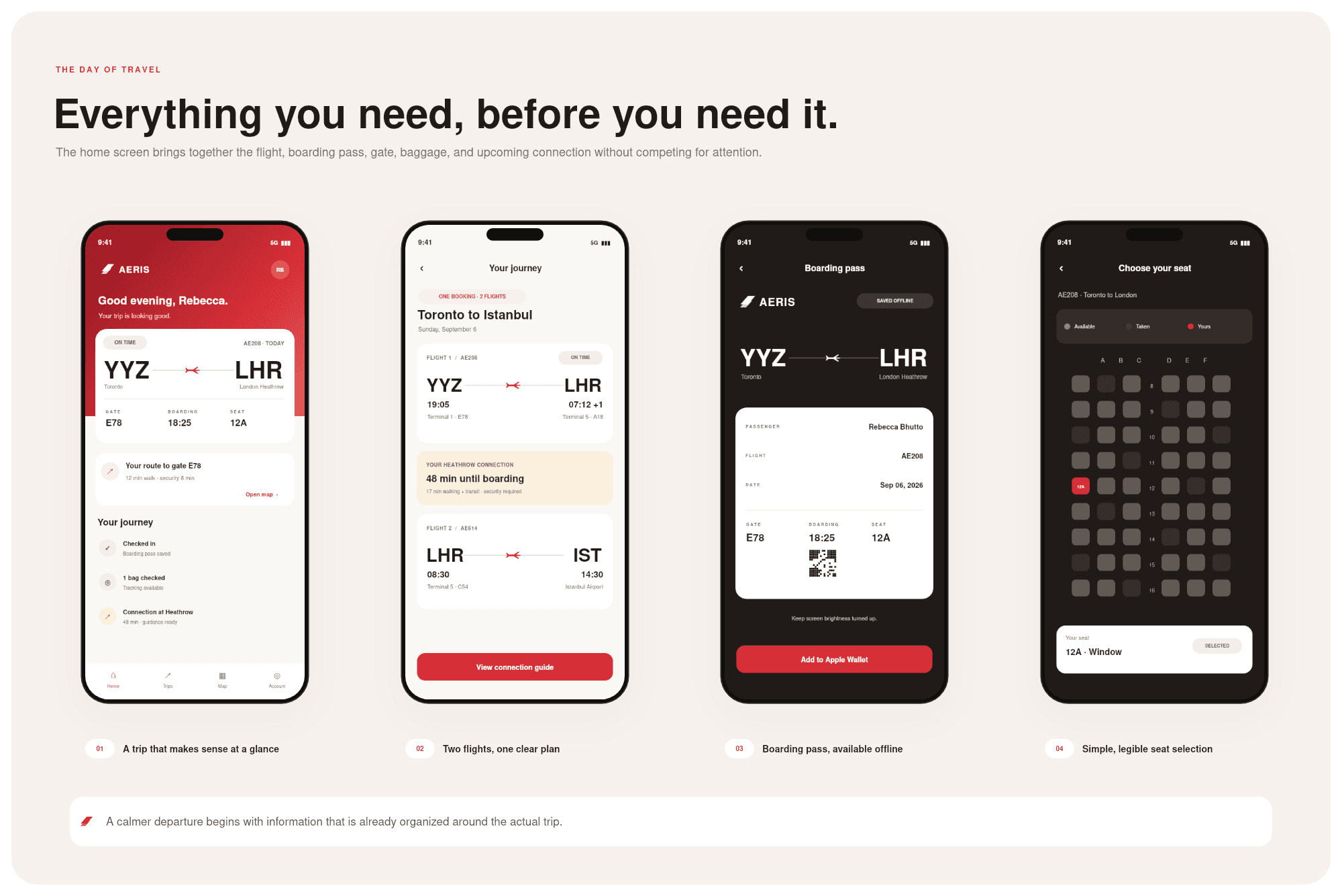
The day-of-travel experience
A map that knows where you are going
AERIS connects the passenger’s flight information to an indoor airport-navigation experience.
Instead of showing a generic terminal map, the app highlights:
The traveler’s current area.
The correct departure gate.
Estimated walking time.
Required terminal transit.
Helpful amenities along the route.
A step-free alternative where available.
If the gate changes, the suggested route changes with it.
This turns airport navigation into a personalized part of the journey rather than a separate tool the passenger must interpret independently.

Making connections easier to understand
A 48-minute layover is not the same as 48 minutes of free time.
AERIS breaks the connection into understandable components:
Walking and terminal transit.
Required security checks.
Boarding deadlines.
Remaining buffer time.
The correct next action.
When a gate changes, passengers see both the updated gate and the revised route.
The goal is not simply to present information; it is to help travelers decide whether they can comfortably make their next flight.

A calmer layover
When a traveler has enough time, the app recommends useful stops that make sense for their route:
Coffee shops.
Accessible washrooms.
Quiet spaces.
Family rooms.
Water refill stations.
Each recommendation is presented alongside the passenger’s available buffer, helping them understand whether they can stop without jeopardizing their connection.
A baggage tracker adds reassurance by showing when luggage has been checked, scanned, loaded, transferred, or delivered, subject to airline data availability.

Accessibility is part of the journey
The fastest route is not necessarily the best route.
Travelers may need lifts instead of escalators, accessible washrooms, additional connection time, lower-sensory directions, or assistance from their operating airline.
AERIS makes these preferences part of route planning rather than treating accessibility as a separate afterthought.
Because availability varies, the experience directs passengers toward official airport and airline resources rather than promising services that have not been confirmed. Toronto Pearson accessibility services

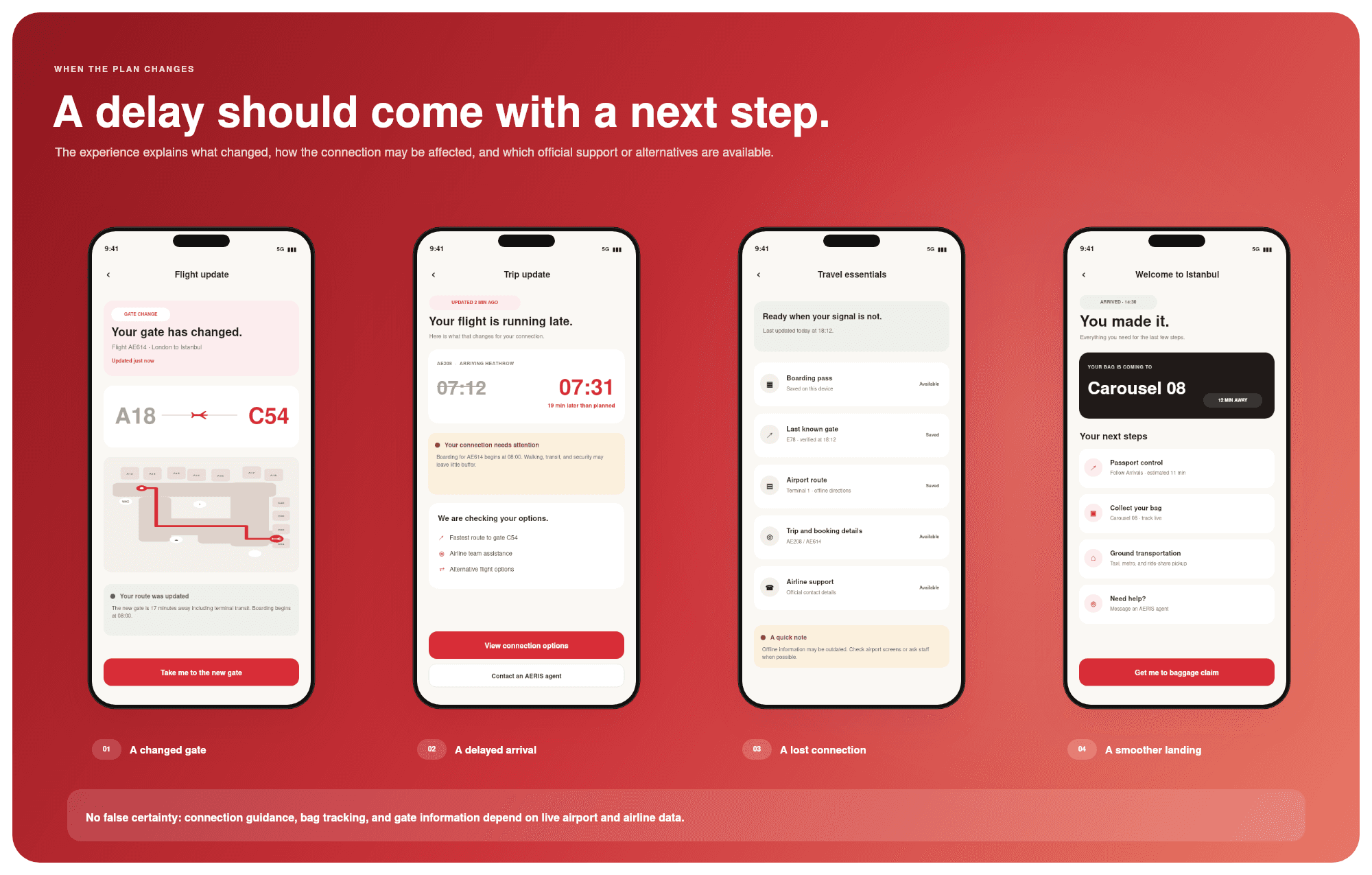
Designing for disruption
Delays, changing gates, and unreliable airport connectivity are normal parts of travel.
AERIS responds by making the next step clear:
Recalculate the passenger’s connection.
Update the route to the new gate.
Present relevant airline support options.
Preserve access to previously saved boarding details.
Distinguish live information from estimated or offline information.
This prevents the interface from creating false confidence when operational details are uncertain.
Visual direction
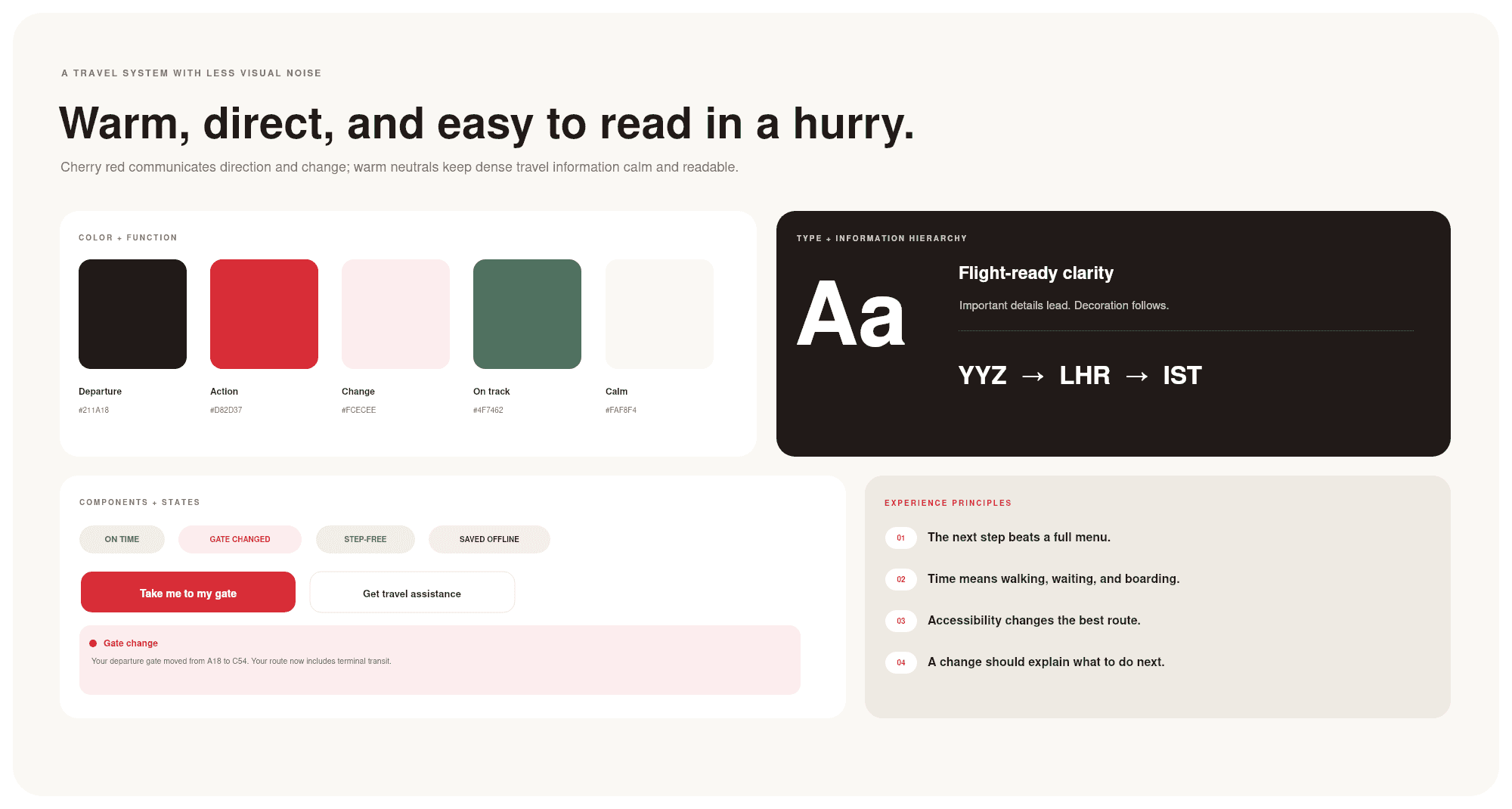
The visual system uses deep red, warm ivory, charcoal, and muted sage to create a premium airline identity without relying on blue or purple.
Red emphasizes important actions and travel changes. Warm neutrals keep dense information readable. Sage supports reassurance and accessible-routing states.
The result is designed to feel distinctive, calm, and easy to scan in time-sensitive environments.
What I would validate
A future usability study would include frequent flyers, occasional travelers, passengers making connections, families, and travelers with accessibility needs.
Key questions would include:
Can passengers identify their next gate quickly?
Do they understand the route and estimated travel time?
Can they interpret connection time, security, and boarding buffers?
Do gate-change alerts lead to the correct action?
Can travelers locate step-free routes and accessibility support?
Can passengers distinguish live information from saved or estimated details?
A future usability study would include frequent flyers, occasional travelers, passengers making connections, families, and travelers with accessibility needs.
Key questions would include:
Can passengers identify their next gate quickly?
Do they understand the route and estimated travel time?
Can they interpret connection time, security, and boarding buffers?
Do gate-change alerts lead to the correct action?
Can travelers locate step-free routes and accessibility support?
Can passengers distinguish live information from saved or estimated details?

Project integrity: AERIS is a fictional conceptual project. Flight numbers, terminal layouts, gate labels, and timings are illustrative. No interviews, usability outcomes, operational integrations, or business results are presented as completed work.
Case Study
AERIS
Every gate. Every connection. A little less chaos.
A research-informed airline experience that helps passengers navigate unfamiliar airports, understand their connections, respond to gate changes, and travel with greater confidence.
Every gate. Every connection. A little less chaos.
A research-informed airline experience that helps passengers navigate unfamiliar airports, understand their connections, respond to gate changes, and travel with greater confidence.
Snapshot
Role
Product designer and UX researcher
Duration
3 weeks
Type
Independent conceptual case study
Focus
Airport navigation, connecting flights, accessibility, and disruption management
The challenge
Booking a flight is rarely the most stressful part of traveling. The uncertainty begins when passengers arrive at the airport and need to find their gate, understand a connection, manage their luggage, or react to sudden changes.
Existing tools can help, but relevant information is often scattered across airline apps, airport websites, boarding passes, terminal signage, and flight alerts.
The design opportunity was straightforward:
How might we help travelers understand exactly what to do next, particularly when they are unfamiliar with the airport or short on time?
Research: What passengers actually need
I reviewed published passenger research, airport navigation tools, connecting-flight guidance, accessibility resources, and existing airline and airport experiences.
Three findings shaped the product direction:
78% of passengers want a more unified app experience for important travel information and credentials.
88% would feel more confident if they could track their baggage in real time. IATA Global Passenger Survey 2025
70% want to reach their gate within 30 minutes when traveling with carry-on luggage. IATA passenger research
Research: What passengers actually need
I reviewed published passenger research, airport navigation tools, connecting-flight guidance, accessibility resources, and existing airline and airport experiences.
Three findings shaped the product direction:
78% of passengers want a more unified app experience for important travel information and credentials.
88% would feel more confident if they could track their baggage in real time. IATA Global Passenger Survey 2025
70% want to reach their gate within 30 minutes when traveling with carry-on luggage. IATA passenger research
Where the travel experience breaks down
I mapped the passenger journey across six moments: preparing for departure, entering the airport, finding the gate, connecting between flights, waiting during a layover, and arriving.
The biggest friction points occur during transitions:
Passengers may know their gate number without understanding how far away it is.
Connection windows do not necessarily account for walking, terminal transfers, security, or boarding deadlines.
Gate-change notifications often communicate what changed without explaining what to do next.
Airport maps may exist independently of the passenger’s actual flight.
Travelers with mobility or sensory needs may require different routes and additional time.
Heathrow notes that connecting passengers must pass through security and may need to change terminals. Toronto Pearson already offers interactive airport maps. The opportunity is to connect these existing capabilities to the traveler’s immediate circumstances. Heathrow connecting-flight guidance · Toronto Pearson terminal maps
Design principle
Show the next useful decision, not every available feature.
Rather than organizing the experience around airline departments, AERIS follows the passenger’s changing situation:
Departure → airport navigation → connection → layover → disruption → arrival.
Early exploration
I began with low-fidelity wireframes focused on four essential interactions:
Understanding the complete trip.
Locating the correct gate.
Assessing whether a connection is manageable.
Responding when plans change.
This established the information hierarchy before visual styling was introduced.
The day-of-travel experience
A map that knows where you are going
AERIS connects the passenger’s flight information to an indoor airport-navigation experience.
Instead of showing a generic terminal map, the app highlights:
The traveler’s current area.
The correct departure gate.
Estimated walking time.
Required terminal transit.
Helpful amenities along the route.
A step-free alternative where available.
If the gate changes, the suggested route changes with it.
This turns airport navigation into a personalized part of the journey rather than a separate tool the passenger must interpret independently.
Making connections easier to understand
A 48-minute layover is not the same as 48 minutes of free time.
AERIS breaks the connection into understandable components:
Walking and terminal transit.
Required security checks.
Boarding deadlines.
Remaining buffer time.
The correct next action.
When a gate changes, passengers see both the updated gate and the revised route.
The goal is not simply to present information; it is to help travelers decide whether they can comfortably make their next flight.
A calmer layover
When a traveler has enough time, the app recommends useful stops that make sense for their route:
Coffee shops.
Accessible washrooms.
Quiet spaces.
Family rooms.
Water refill stations.
Each recommendation is presented alongside the passenger’s available buffer, helping them understand whether they can stop without jeopardizing their connection.
A baggage tracker adds reassurance by showing when luggage has been checked, scanned, loaded, transferred, or delivered, subject to airline data availability.
Accessibility is part of the journey
The fastest route is not necessarily the best route.
Travelers may need lifts instead of escalators, accessible washrooms, additional connection time, lower-sensory directions, or assistance from their operating airline.
AERIS makes these preferences part of route planning rather than treating accessibility as a separate afterthought.
Because availability varies, the experience directs passengers toward official airport and airline resources rather than promising services that have not been confirmed. Toronto Pearson accessibility services
Designing for disruption
Delays, changing gates, and unreliable airport connectivity are normal parts of travel.
AERIS responds by making the next step clear:
Recalculate the passenger’s connection.
Update the route to the new gate.
Present relevant airline support options.
Preserve access to previously saved boarding details.
Distinguish live information from estimated or offline information.
This prevents the interface from creating false confidence when operational details are uncertain.
Visual direction
The visual system uses deep red, warm ivory, charcoal, and muted sage to create a premium airline identity without relying on blue or purple.
Red emphasizes important actions and travel changes. Warm neutrals keep dense information readable. Sage supports reassurance and accessible-routing states.
The result is designed to feel distinctive, calm, and easy to scan in time-sensitive environments.
What I would validate
A future usability study would include frequent flyers, occasional travelers, passengers making connections, families, and travelers with accessibility needs.
Key questions would include:
Can passengers identify their next gate quickly?
Do they understand the route and estimated travel time?
Can they interpret connection time, security, and boarding buffers?
Do gate-change alerts lead to the correct action?
Can travelers locate step-free routes and accessibility support?
Can passengers distinguish live information from saved or estimated details?
A future usability study would include frequent flyers, occasional travelers, passengers making connections, families, and travelers with accessibility needs.
Key questions would include:
Can passengers identify their next gate quickly?
Do they understand the route and estimated travel time?
Can they interpret connection time, security, and boarding buffers?
Do gate-change alerts lead to the correct action?
Can travelers locate step-free routes and accessibility support?
Can passengers distinguish live information from saved or estimated details?
Project integrity: AERIS is a fictional conceptual project. Flight numbers, terminal layouts, gate labels, and timings are illustrative. No interviews, usability outcomes, operational integrations, or business results are presented as completed work.
Case Study
AERIS
Every gate. Every connection. A little less chaos.
A research-informed airline experience that helps passengers navigate unfamiliar airports, understand their connections, respond to gate changes, and travel with greater confidence.
Every gate. Every connection. A little less chaos.
A research-informed airline experience that helps passengers navigate unfamiliar airports, understand their connections, respond to gate changes, and travel with greater confidence.
Snapshot
Role
Product designer and UX researcher
Duration
3 weeks
Type
Independent conceptual case study
Focus
Airport navigation, connecting flights, accessibility, and disruption management
The challenge
Booking a flight is rarely the most stressful part of traveling. The uncertainty begins when passengers arrive at the airport and need to find their gate, understand a connection, manage their luggage, or react to sudden changes.
Existing tools can help, but relevant information is often scattered across airline apps, airport websites, boarding passes, terminal signage, and flight alerts.
The design opportunity was straightforward:
How might we help travelers understand exactly what to do next, particularly when they are unfamiliar with the airport or short on time?
Research: What passengers actually need
I reviewed published passenger research, airport navigation tools, connecting-flight guidance, accessibility resources, and existing airline and airport experiences.
Three findings shaped the product direction:
78% of passengers want a more unified app experience for important travel information and credentials.
88% would feel more confident if they could track their baggage in real time. IATA Global Passenger Survey 2025
70% want to reach their gate within 30 minutes when traveling with carry-on luggage. IATA passenger research
Research: What passengers actually need
I reviewed published passenger research, airport navigation tools, connecting-flight guidance, accessibility resources, and existing airline and airport experiences.
Three findings shaped the product direction:
78% of passengers want a more unified app experience for important travel information and credentials.
88% would feel more confident if they could track their baggage in real time. IATA Global Passenger Survey 2025
70% want to reach their gate within 30 minutes when traveling with carry-on luggage. IATA passenger research
Where the travel experience breaks down
I mapped the passenger journey across six moments: preparing for departure, entering the airport, finding the gate, connecting between flights, waiting during a layover, and arriving.
The biggest friction points occur during transitions:
Passengers may know their gate number without understanding how far away it is.
Connection windows do not necessarily account for walking, terminal transfers, security, or boarding deadlines.
Gate-change notifications often communicate what changed without explaining what to do next.
Airport maps may exist independently of the passenger’s actual flight.
Travelers with mobility or sensory needs may require different routes and additional time.
Heathrow notes that connecting passengers must pass through security and may need to change terminals. Toronto Pearson already offers interactive airport maps. The opportunity is to connect these existing capabilities to the traveler’s immediate circumstances. Heathrow connecting-flight guidance · Toronto Pearson terminal maps
Design principle
Show the next useful decision, not every available feature.
Rather than organizing the experience around airline departments, AERIS follows the passenger’s changing situation:
Departure → airport navigation → connection → layover → disruption → arrival.
Early exploration
I began with low-fidelity wireframes focused on four essential interactions:
Understanding the complete trip.
Locating the correct gate.
Assessing whether a connection is manageable.
Responding when plans change.
This established the information hierarchy before visual styling was introduced.
The day-of-travel experience
A map that knows where you are going
AERIS connects the passenger’s flight information to an indoor airport-navigation experience.
Instead of showing a generic terminal map, the app highlights:
The traveler’s current area.
The correct departure gate.
Estimated walking time.
Required terminal transit.
Helpful amenities along the route.
A step-free alternative where available.
If the gate changes, the suggested route changes with it.
This turns airport navigation into a personalized part of the journey rather than a separate tool the passenger must interpret independently.
Making connections easier to understand
A 48-minute layover is not the same as 48 minutes of free time.
AERIS breaks the connection into understandable components:
Walking and terminal transit.
Required security checks.
Boarding deadlines.
Remaining buffer time.
The correct next action.
When a gate changes, passengers see both the updated gate and the revised route.
The goal is not simply to present information; it is to help travelers decide whether they can comfortably make their next flight.
A calmer layover
When a traveler has enough time, the app recommends useful stops that make sense for their route:
Coffee shops.
Accessible washrooms.
Quiet spaces.
Family rooms.
Water refill stations.
Each recommendation is presented alongside the passenger’s available buffer, helping them understand whether they can stop without jeopardizing their connection.
A baggage tracker adds reassurance by showing when luggage has been checked, scanned, loaded, transferred, or delivered, subject to airline data availability.
Accessibility is part of the journey
The fastest route is not necessarily the best route.
Travelers may need lifts instead of escalators, accessible washrooms, additional connection time, lower-sensory directions, or assistance from their operating airline.
AERIS makes these preferences part of route planning rather than treating accessibility as a separate afterthought.
Because availability varies, the experience directs passengers toward official airport and airline resources rather than promising services that have not been confirmed. Toronto Pearson accessibility services
Designing for disruption
Delays, changing gates, and unreliable airport connectivity are normal parts of travel.
AERIS responds by making the next step clear:
Recalculate the passenger’s connection.
Update the route to the new gate.
Present relevant airline support options.
Preserve access to previously saved boarding details.
Distinguish live information from estimated or offline information.
This prevents the interface from creating false confidence when operational details are uncertain.
Visual direction
The visual system uses deep red, warm ivory, charcoal, and muted sage to create a premium airline identity without relying on blue or purple.
Red emphasizes important actions and travel changes. Warm neutrals keep dense information readable. Sage supports reassurance and accessible-routing states.
The result is designed to feel distinctive, calm, and easy to scan in time-sensitive environments.
What I would validate
A future usability study would include frequent flyers, occasional travelers, passengers making connections, families, and travelers with accessibility needs.
Key questions would include:
Can passengers identify their next gate quickly?
Do they understand the route and estimated travel time?
Can they interpret connection time, security, and boarding buffers?
Do gate-change alerts lead to the correct action?
Can travelers locate step-free routes and accessibility support?
Can passengers distinguish live information from saved or estimated details?
A future usability study would include frequent flyers, occasional travelers, passengers making connections, families, and travelers with accessibility needs.
Key questions would include:
Can passengers identify their next gate quickly?
Do they understand the route and estimated travel time?
Can they interpret connection time, security, and boarding buffers?
Do gate-change alerts lead to the correct action?
Can travelers locate step-free routes and accessibility support?
Can passengers distinguish live information from saved or estimated details?
Project integrity: AERIS is a fictional conceptual project. Flight numbers, terminal layouts, gate labels, and timings are illustrative. No interviews, usability outcomes, operational integrations, or business results are presented as completed work.